Why AcuRite’s New App Swap Feels Like a Total Tech Fail
AcuRite is forcing users to switch to a new, inferior app by May 30th. I look at why this move is angering loyal weather station owners everywhere.
When old reliable gets kicked to the curb
For years, My AcuRite was the standard. It launched back in 2016. It wasn't perfect. But it worked for most folks. It kept tabs on rain, wind, and heat. Users grew used to the interface. They knew where to find their data. They built habits around the old system. It was a stable part of their home setup. Then came the emails. AcuRite told everyone to move. They want us on the AcuRite Now app. The deadline is May 30, 2026. After that, the old app just stops. This isn't a suggestion. It is a hard lock. If you don't move, you lose your connection. That is a bold move for a brand. It risks a lot of goodwill.The trouble with the new kid on the block
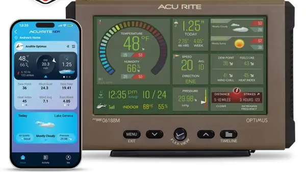
The new app is AcuRite Now. It came out in 2025. It was built for the AcuRite Optimus station. Now, it is the only option for almost everyone. People are not happy. The app stores are filled with hate. It has a 1.4-star rating on Apple. It sits at 1.3 stars on Google Play. That is abysmal. What is the beef? Users say it is missing basic stuff. You can't rename sensors easily. The data display is tiny. It wastes space on the screen. It also rounds temperatures. That drives pros crazy. If you track weather, you need precision. Whole numbers just don't cut it. It feels like a toy, not a tool. Some say it looks like a joke. The layout feels cluttered. It doesn't match the clean look of the old app. People feel like they took a step back in time. The company says they are "hoping" to fix things. They promise a desktop version soon. But promises don't help you today. People want a working app right now.Under the hood of the new ecosystem
The new app is built on Tuya's SmartLife platform. This is a big shift. Tuya connects thousands of devices. It handles fans, lights, and plugs. Maybe they want a unified smart home. That sounds good on paper. But it changes the focus. The app isn't just for weather now. It is a general IoT dashboard. This explains the bloat. The app has to juggle too much. It isn't specialized for weather anymore. That is why the UI feels so off. There is also the money angle. AcuRite Now+ is the premium tier. It costs $2 a month. You get longer data history. You also get better sharing tools. Some features were free before. Now, you pay for them. That is a hard pill to swallow. It feels like a cash grab to many.The risk of pushing loyal fans away
I see why they did it. Maintaining two apps is expensive. A single platform saves money. It also lets them sell more gear. But the cost is high. You can't treat users like numbers. When you break their workflow, they leave. Loyalty is not a permanent state. If the app stays this buggy, people will jump ship. They will buy other brands. There are plenty of rivals out there. The market for sensors is huge. Updated tech should add value. It should not subtract features. When it does, it fails. I hope they realize this before it is too late.A few answers to common questions
- When does the old app die? It shuts down on May 30, 2026. You must switch by then.
- Can I keep using My AcuRite? No. It will stop connecting to your devices entirely.
- Is the new app really that bad? Most users think so. The low ratings reflect missing features and poor design.
- Do I have to pay for the new app? The basic app is free. But extra features now require a monthly fee.
- Will they bring back the old features? They say they are working on it. There is no firm date for those updates.
My honest take on this
I think this is a classic tech blunder. They focused on the backend and forgot the user. It is easy to build a platform. It is hard to build a good one.
I hate being forced into a subscription. If I bought the hardware, I own the data. Charging me to see my own history is wrong. It feels greedy.
The app feels like a generic template. It lacks the polish of a dedicated tool. I would rather pay more for better software. I don't want a "one size fits all" app.
I suspect they will lose a lot of customers. People have long memories. When you mess with their daily routines, they don't forget it easily. This is a gamble they will likely regret.