Windows 11 Taskbar Changes: Finally Giving You Control
Microsoft is finally letting you move the Windows 11 taskbar to any edge of your screen. Here is what you need to know about these updates.
You probably remember the frustration of the first Windows 11 release. Microsoft stripped away the simple ability to move your taskbar. It felt like a step back for many power users. I hated it. It just didn't make sense to lock us into a bottom-only layout.
Thankfully, they finally heard the feedback. Microsoft is working on a major update to fix this. You'll soon regain the freedom to place your bar where you want. It's about time they gave us back our desktop control.
Forget the fancy AI fluff for a moment. This update is purely about making the OS work for you. It's a win for anyone who loves a clean, custom desk. Let's look at how they are changing the game.
Why desktop layout matters so much
For years, Windows users took taskbar placement for granted. You could snap it to the sides or the top without a second thought. It was a staple of the classic Windows UI. Then came the big redesign with Windows 11. They wiped the list clean and forced the bottom-only look.
Many people found this limiting. If you use a wide monitor, a side-mounted taskbar saves vertical space. It keeps your main work area open. Some users just prefer their icons on the side for better reach. It's a small change that feels massive for daily flow.
I think the push for this change came from the community. People kept asking for it on forums and feedback hubs. Microsoft finally realized that utility beats aesthetics. They are now prioritizing the basics of the OS again.
What you can expect soon
The big headline here is total freedom. You can move the taskbar to the top, bottom, left, or right edge. It works exactly how you remember it from older versions. But it's not just about placement. They added more icon alignment options too.
You can center your Start button or push it to the side. This applies to all four edges of the screen. Want a top-aligned bar with icons on the left? You can do that. Prefer a centered look on the right side? That works too.
If you choose a side-mounted bar, you have even more choices. You can keep it thin like the standard bottom bar. Or, you can expand it. The wider version shows full labels for your open apps. It's a great way to manage tons of windows at once.
They are even adding an extra-thin mode. This is perfect for small screens or tablets. It keeps the clutter away and lets you focus on your tasks. Every pixel counts when you're working on a budget laptop.
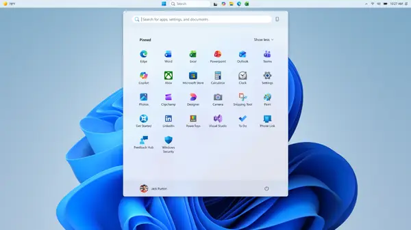
The Start menu is getting a refresh as well. It's not just about moving things around. They are cleaning up the Recommended section. It will soon be renamed to Recent. This label makes much more sense for what it displays.
You'll also get more control over what shows up there. You can toggle off the Pinned or Recommended sections entirely. It's a huge privacy win. You can even hide your profile picture if you want a cleaner look.
Technical tweaks under the hood
Microsoft isn't just moving UI elements around. They are refining the logic behind the Recent section. The system will get better at picking which files to show. It aims to reduce noise and highlight what you really need.
The sorting logic is also getting a pass. They want the list to reflect your actual work habits. No more random files cluttering your view. It's all about making the menu feel smarter and more personal.
These changes are currently rolling out to the Insider channels. If you are part of the testing group, you'll see it soon. They haven't set a public date yet. But typically, these tests move to the main build within a few months.
Looking ahead at the windows UI
This shift shows a focus on core quality. Microsoft seems to be listening to power users again. It's a nice change from the constant focus on new services. We just want a PC that works the way we want.
I hope they keep this momentum going. More control over the OS is always a good thing. There are still other areas that need this level of polish. Maybe they'll look at the file explorer next.
Whatever happens, this is a solid step forward. It makes Windows 11 feel more mature. It's no longer just a locked-down experience. Now, it feels like a tool that you can own.
Quick questions answered
Can I move the taskbar to the top of the screen?
Yes, the new update will allow top, bottom, left, and right placement for your taskbar.
Will these changes be free for everyone?
Yes, this will be part of a standard Windows 11 update once it exits the testing phase.
Can I hide my profile picture in the Start menu?
Yes, they are adding a setting to hide your name and profile photo for better privacy.
Will the Start menu look different?
It will look mostly the same, but you will have more control over the size and the content shown in the Recent section.
When can I get these features?
They are hitting the Insider Experimental channel now. A full release should follow in a few months.
My honest take on this
I am honestly pumped for this. I have missed the side taskbar since I moved to Windows 11. It's a small detail, but it changes everything for my workflow. I like having my apps on the left side of my monitor.
The thing that gets me is why it took so long. It's a basic feature that should have been there from day one. I don't get why they felt the need to remove it. But I'm glad they are fixing the mistake now.
I think the focus on quality is a smart move. Everyone is tired of bloatware and unnecessary AI features. We just want a stable system that doesn't get in our way. This update proves they can still do that when they want to.
I'll be moving my taskbar as soon as the update hits my main rig. It's going to make my desktop look so much better. Honestly, I can't wait to see how the wider vertical bar feels. It's the small wins that keep me using Windows.